MTS CINEMA +
Case Study
Movie Theater Seat Reservation App prototype. App for everyone, including those with special requirements.
My Role
UX leader at research planning, usability study, visual design, UX prototyping.
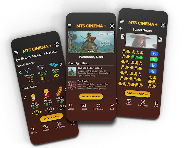
Table of Contents
Project Vision
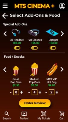
MTS Cinema + is a premium movie theater app where users can reserve seats with special add-ons (VR Headset, phone chargers, immersive audio headset, 3D glasses, etc.). Also, this app includes selections for users with special requirements or disabilities.
Challenges
- Create an easy-to-use app to reserve movie theater seats.
- Include add-ons for special requirements and accessibility.
- Design a visually appealing interface suitable for everyone with high contrast colors.
Disclaimer: This seat reservation prototype case study was part of my Google UX Design Professional Certification. If you require a UX Research Study or develop an app similar to MTS Cinema +, please contact me through my contact section.
Introduction
I found that most movie theaters didn’t include options for people with special requirements. For example, if a movie has VR capabilities or immerse 3D audio, there is a market share for users that will have a better experience with add ons that will enrich their user experience during the showtime.
Furthermore, analyzing data and knowing more about the movie theater industry, I found that people with disabilities or special requirements were excluded from seat reservations in movie theater apps, even though they offer a few options for people with special requirements on the theater venue.
My project goal
Design a premium movie theater seat reservation app for everyone, working together with a local movie theater.
Target Audience
All users that enjoy movie theaters, and users with special requirements, or people with disability or accessibility needs
User Personas
Willy Tonka
Age: 22 | Occupation: Game Tester
Willy is a serious PC games player, currently hired part-time by Electronic Arts to test games. He is studying Audio Engineering, and he loves video games and movies surround audio and music. He loves chocolates, donuts, and cupcakes. He likes to experience new technologies, and he would love all movie theaters includes 3D immersive audio, Virtual Reality, 360 experience, and wireless phone charger.
Geneva Petroska
Age: 41 | Occupation: Online teacher
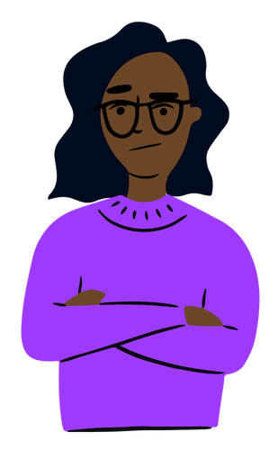
Geneva is a United States immigrant with a green card. She speaks fluid English with a little Russian accent. She is an accounting student. She has a disability that doesn’t allow her to walk, and she requires to use a wheelchair for a few years. Geneva really enjoys watching movies. She would like more space for her wheelchair in the seats and that she could reserve a seat using an app.
Competitive Analysis
I examined several premium movie theaters and their mobile apps. Even though some of their apps are really good, they missed some features that MTS Cinemas + is including since the original paper wireframe.
I reduced the list to the following popular movie theaters:


Even though they have some great apps, we noticed the absence of special add-ons and accessibility options on the design of their apps.
Problem Statement
Willy is an audio engineering student who enjoys movie theaters to experience immersive 3D Audio; however, it is pretty difficult to go to because he could not find movie theater apps to reserve a seat and add-ons for his audio needs.
Geneva is an online teacher who enjoys movie theaters during weekends but is pretty difficult to go to because she could not find movie theater apps to reserve a seat for her wheelchair space and special needs.
User Research
I conducted interviews with target users. I found the following pain points:
- Most users said they would like more purchase options for the apps they used before.
- Users with accessibility needs complained about being excluded from movie theater reservation apps.
- Some users mentioned using the app on-premises to request food or add-ons during the showtime.
- QR Code ticket is confusing for some users if they don't find instructions on the app.
The information was clear enough to set a starting point for MTS Cinema + app wireframes.
UX Storyboards
Feel free to laugh looking at my drawings. Believe it or not, I did not have any printer, paper, or pencil at hand at the moment I begin to draw, so I did my best using the mouse and trackpad of my laptop.
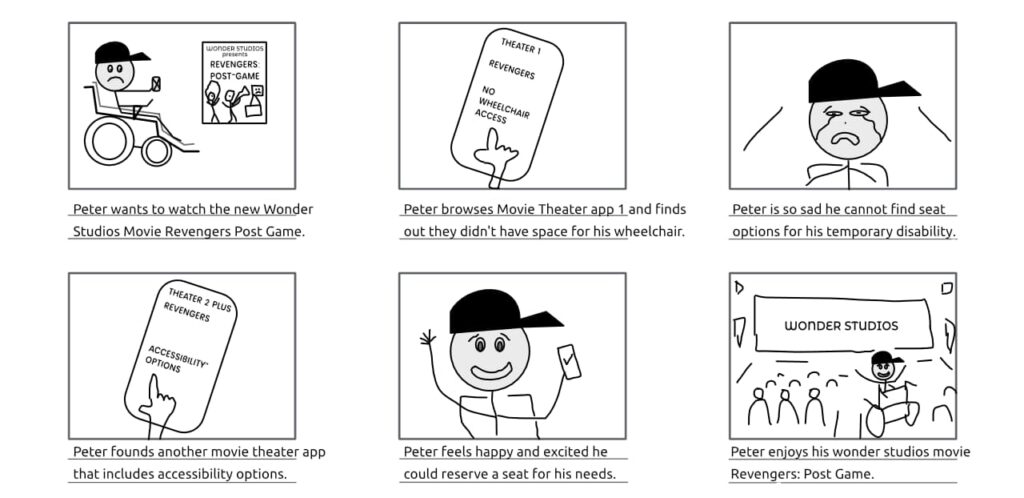
UX Storyboard - Big Picture
User emotional journey.
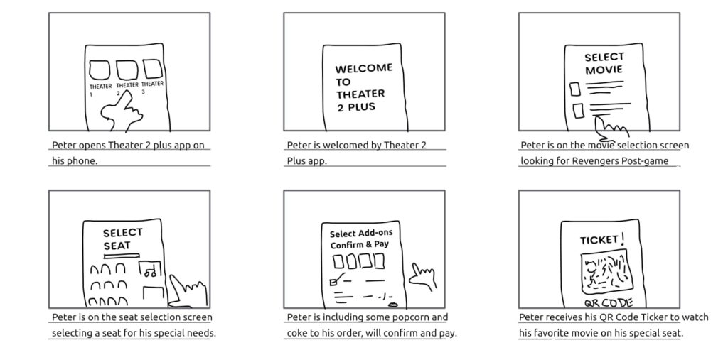
UX Storyboard - Close up
Quick user experience app walkthrough.
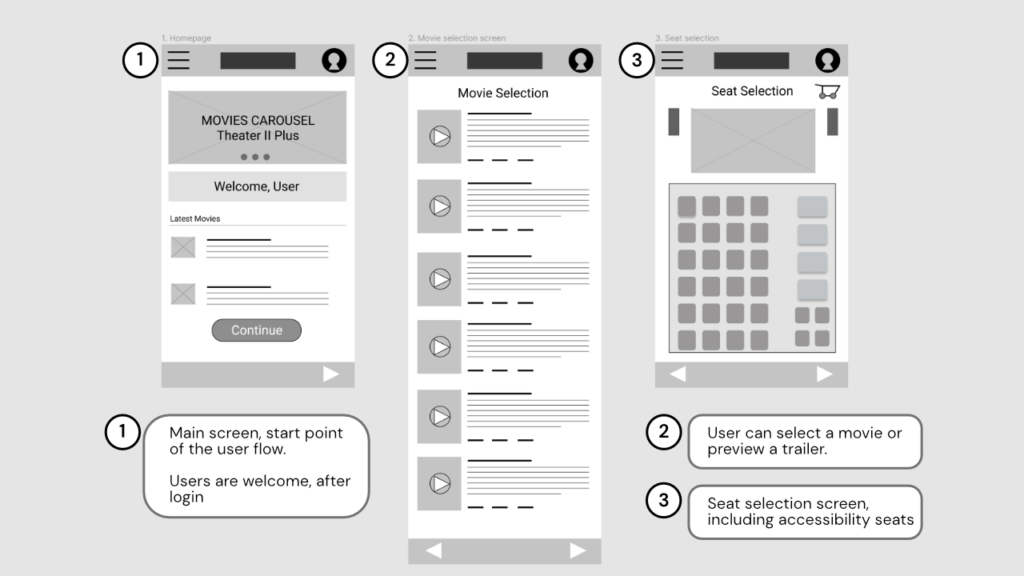
Initial Designs - Wireframes
Take a sneak peek to my initial designs. Let’s begin with the initial user flow:
To continue the user flow, please feel free to test the wireframe prototype. for the movie theater seat reservation app.
Usability Study
Unmoderated Usability Study
Locations: Mexico, United States, Canada*
Dates: March 27, 28 & 29 / 2021.
Length: Each session lasted between 10 to 20 minutes according to the user’s pace.
Participants: Five participants, each completing the study individually.
Details: Ten participants in each location, chosen randomly. Each participant completed 5 questions and gave feedback about 5 possible scenarios for the app.
Compensation: $25 gift card to each participant to use in MTS Cinemas + Movie theaters.
*Each participant went through the usability study in their own home.
Usability Study - Results
Users were confused in the add-ons selection screen because the price didn’t was clear.
Most users were looking for a “my cart” button on the screen but could not find it anywhere.
Users felt dizzy because the animations between screens were all different.
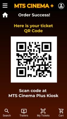
Some users didn’t know how to use the QR Code and how it works in the movie theater.
High Fidelity Prototype
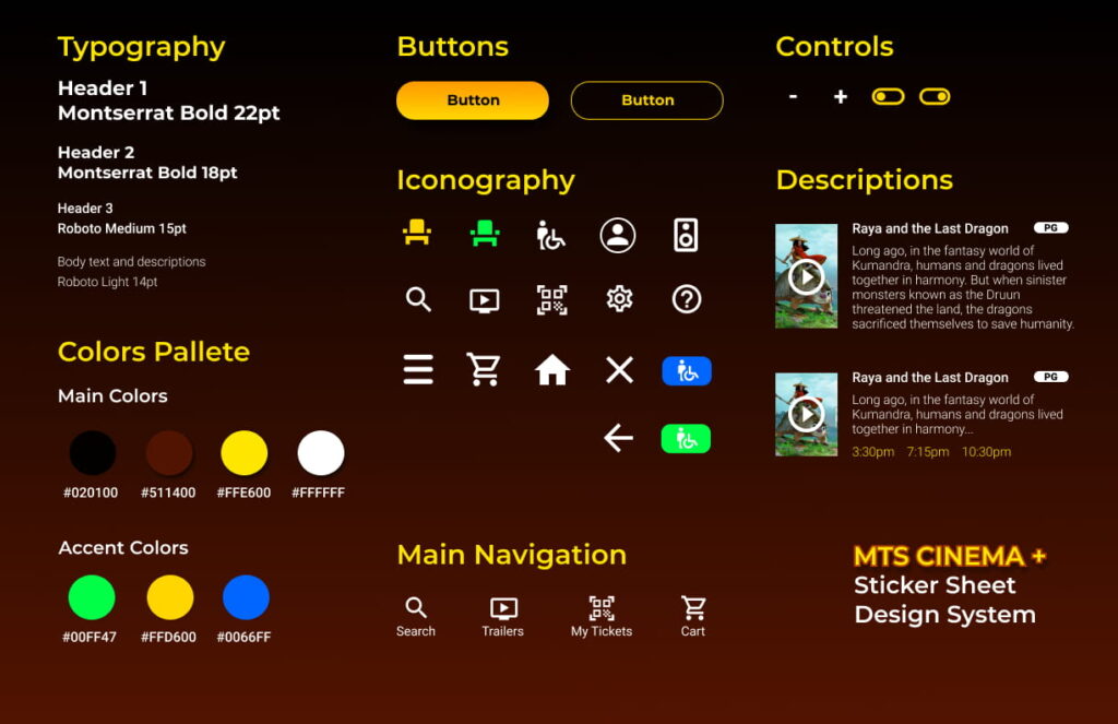
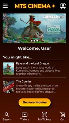
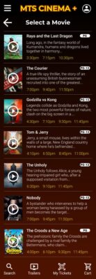
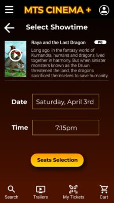
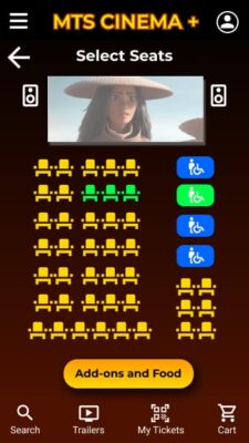
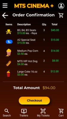
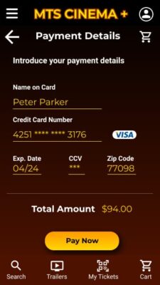
After synthesizing the insights and analyzing the results, I built the following hi-fi prototype for the movie theater seat reservation app.
Additional Research
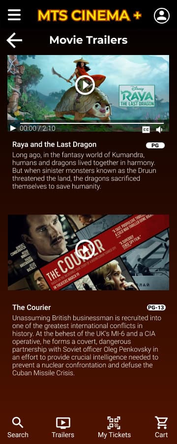
After receiving more feedback for the hi-fi prototype of the MTS Cinema + seat reservation app, I will introduce additional screens, like the movie trailers. Cart, ticket list, and help section screens will be added soon.
Accesibility
I built the seat reservation prototype thinking about accessibility since the beginning of this project. I’m very aware that empathy is one of the main pillars of a great UX designer. Let me explain briefly what I included:
- I Followed WCAG Standard colors for good contrast considering users with impairments.
- I included labels in items for assistive technology devices.
- Closed captions in movie trailers will have different color options for contrast.
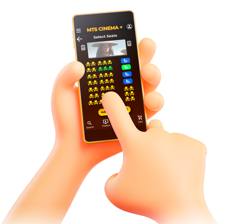
- The seat selection for disabled persons in wheelchairs is allowed in-app.
What I Learned
From the sketch to the paper prototype, then the wireframe to low fidelity prototype, I learned that a good visual design is so much more than jumping right away to build an app or website.
I learned that iterating the prototype very often after peer’s, user feedback, and usability studies, improves the visual design and user experience.
After all this journey I can say WOW. It has been an amazing path from empathy, new knowledge, and understanding of User Experience, and something that I noticed during this time is that UX also makes us feel united as designers.
I would like to give special thanks to my tutors from Google UX Design Professional Certification, my peers who gave me a lot of feedback, and my sponsor Unitytop.
Moving forward, I would like to perform new usability studies for this project, to solve any pain point that a user could experience at this stage. This will fulfill the goals of the project.
Did you like my case study?

It’s my pleasure to help all UX students and enthusiasts. You can take this or any of my case studies as a guide for your UX certification process.
Feel free to contact me, using the contact page on my site. Also, you can contact me via LinkedIn and schedule a call with me. I’ll be more than happy to answer your questions about the entire UX Design process, and review your assignments in Coursera, EDX, Interactive Design Foundation, or any other professional UX design certification course.

