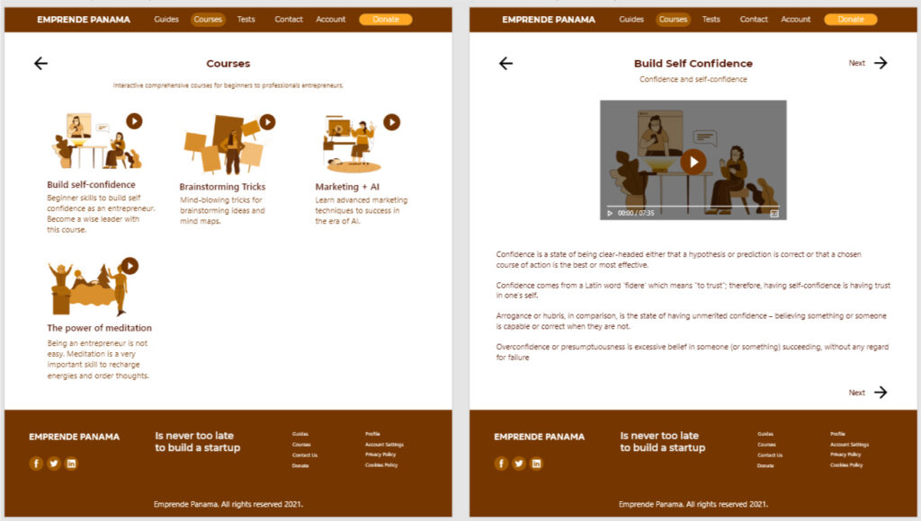
EMPRENDE PANAMA CASE STUDY
A social good online platform to help Panamanian adults and seniors learn basic and professional skills to start their own business.
My Role
UX leader at research planning, usability study, synthesize data, visual design, UI design, UX prototyping.
Project Vision
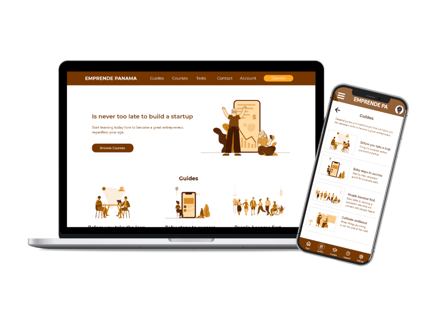
Emprende Panama is a social good online platform to help Panamanian adults and seniors learn basic and professional skills to start their own business. The objective of EPA is to give a step-by-step and accessible guide and courses of entrepreneurship to people that are struggling in emotional, financial, and health areas, including those with disabilities and special conditions.
Challenges
- Create an easy-to-use website considering adults, seniors, and people with disabilities.
- Include add-ons for special requirements and accessibility.
- Design a visually appealing interface suitable for everyone with happy, energized colors.
- Design a dedicated mobile app.
Introduction
I found that people in Panama have a specific cultural bias. Users are pre-conditioned to think that they cannot start a business because of their social status or that if you don’t have thousands or millions of dollars, you cannot start any business.
My project goal
We will tackle this cultural bias problem by providing constant and updated free education to everyone through the Emprende Panama online platform, offering them an amazing user experience to learn the business and entrepreneurial abilities at their pace and skill level regardless of educational background.
Target User
People struggling with self-esteem and emotions, financial limitations, and/or do not receive health care between 35 and 65 years old.
User Personas
Marcelo Graham
Age: 39 | Occupation: Unemployed
Marcelo is a construction worker who is tired of working in that field. He lives in San Miguelito district. He heard about startups, but he could not find convincing tutoring about entrepreneurship in Panama. He strives to find a solution to his finances, but he understands that something is missing before he jumps into entrepreneurship and wants to find real good advice and tutoring to build his startup. He doesn’t have a computer and browses the internet with his smartphone.
Yurivia Rodriguez
Age: 51| Occupation: Hotel Administrator
Yurivia is a former hotel administrator in Panama. Because of the pandemic, she lost her job and found herself living limited with the government aid called “Panama Solidario,” which pays her for food and first needs articles. However, the government pays her very unorganized way, and she doesn’t know what to expect. She has a computer and knows that building a start-up could be a solution for her life, and she would like to create something related to her career in Tourism; however, she is shy and doesn’t know how to begin, and does not have money to invest.
Competitive Analysis
I didn’t find any online social good platform like Emprende Panama, however, I found a few direct and indirect competitors.
One of the competitors is a government institution focused in micro businesses like food stands, cheap accessories kiosk sales and similar.
I reduced the list to this direct and indirect competitors:
Analyzing the competitors and their strengths and flaws, I found that Emprende Panama has many opportunities to become a great social good online platform for Panamanians.
Problem Statement
Marcelo is a construction worker who wants to build a startup in Panama because he needs to buy a house to live happily with his family.
Yurivia is a hotel administrator who lost her job because of the pandemics and wants to start a business as soon as possible because she needs to stabilize her financial situation.
User Research
I conducted interviews with target users. I found the following pain points:
- The main issues were emotional and psychological bias, including the impostor syndrome.
- Most users said they were not ready to venture into a startup or business because of their lack of education.
- Users have a precondition to believe that they were "not born to build a business" or that only millionaires can build startups.
I found so many pain points related to education, psychology, cognitive bias, and the information enough to set a starting point for Emprende Panama dedicated mobile app and website wireframes.
Initial Designs - Wireframes
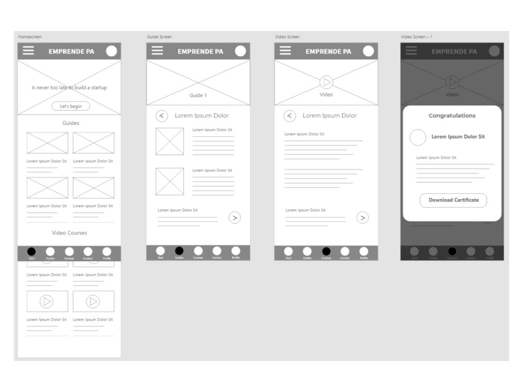
Dedicated Mobile App
Take a sneak peek at my initial designs. Let’s begin with the initial user flow:
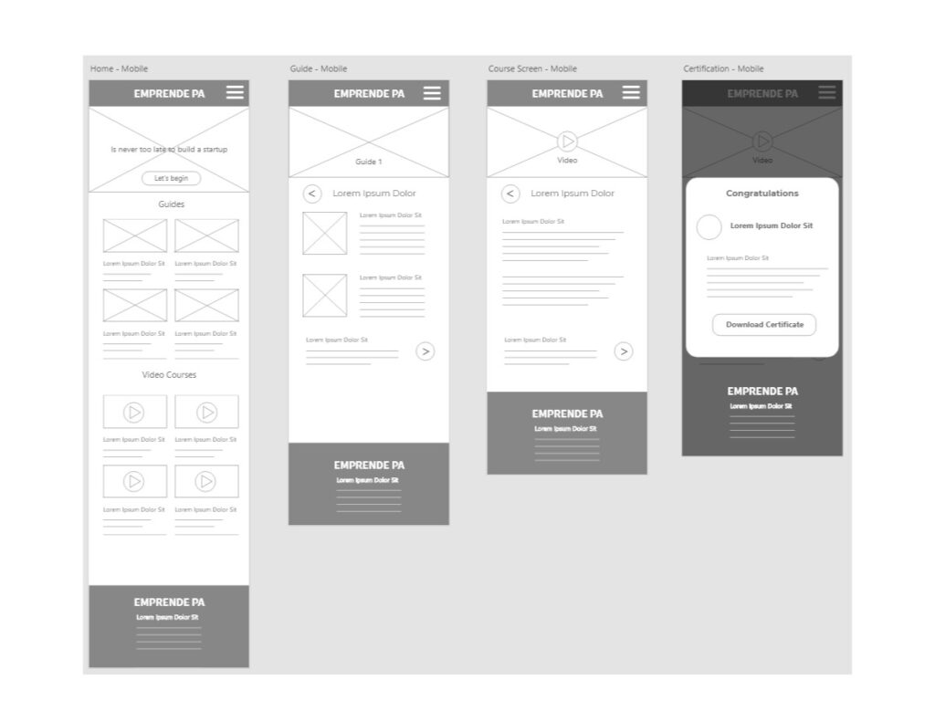
Mobile Responsive Website Wireframe
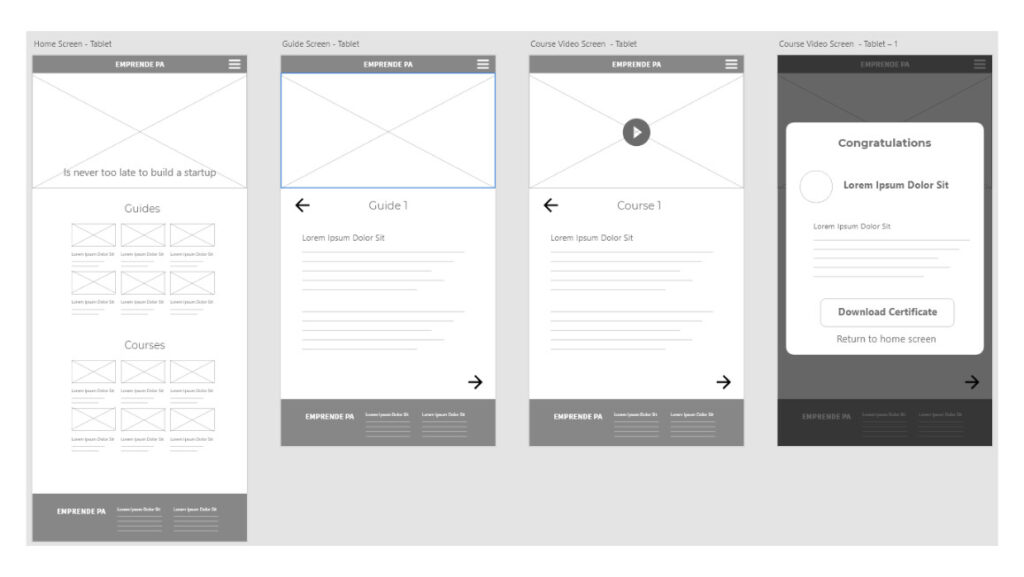
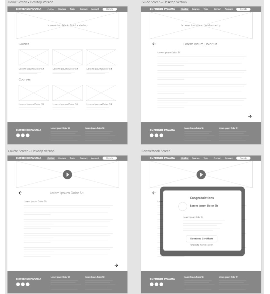
I began drawing the wireframes for the responsive website using the progressive enhancement approach (from the emerging market’s smallest screen devices to the biggest screens).
Tablet Responsive Website Wireframe
Desktop Responsive Website Wireframe
Low Fidelity Prototype
Dedicated Mobile App
Please feel free to test the low fidelity prototype for the Emprende Panama dedicated mobile app to continue the user flow.
Usability Study
Unmoderated Usability Study
Locations: Panama City, Panama.
Dates: April 15 to 16, 2021.
Length: Each session lasted between 25 to 30 minutes according to the user pace.
Participants: Fifteen participants, each completing the study individually.
Details: Fifteen participants in each location, chosen randomly. Each participant completed 5 questions and gave feedback about 5 possible scenarios for the website.
Compensation: 25 dollars gift card to use in a local supermarket.
*Each participant went through the usability study in their own home.
Usability Study - Results
The user didn’t find a guide
list after
the home screen.
Confusion on the last screen after download the certificate.
Users wanted
better visual cues to move between screens.
Users did not understand the user flow after the home screen.
Insights Identification and Priorities
After synthesizing the data of the usability study I found the following insights and divided the priorities from critical to noncritical.
Priority 0
Based on the theme that: User didn’t find a guides list or courses list after the home screen, an insight is: the app should add a guide and course list to the app.
Based on the theme that the user didn’t understand the user flow after the home screen, an insight is: improve the mobile app’s user interface with focal points on the screen.
Priority 1
Based on the theme that: User recommended better visual cues for moving between screens, an insight is: the app should include previous and next buttons near the top of the screen.
Priority 2
Based on the theme that: The user got confused in the congratulations screen after tapping download certificate, an insight is: the certificate screen should be improved adding a return to home screen button.
High Fidelity Prototype
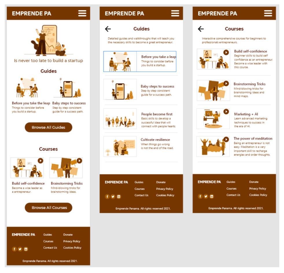
Mobile App Version
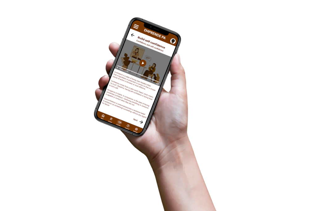
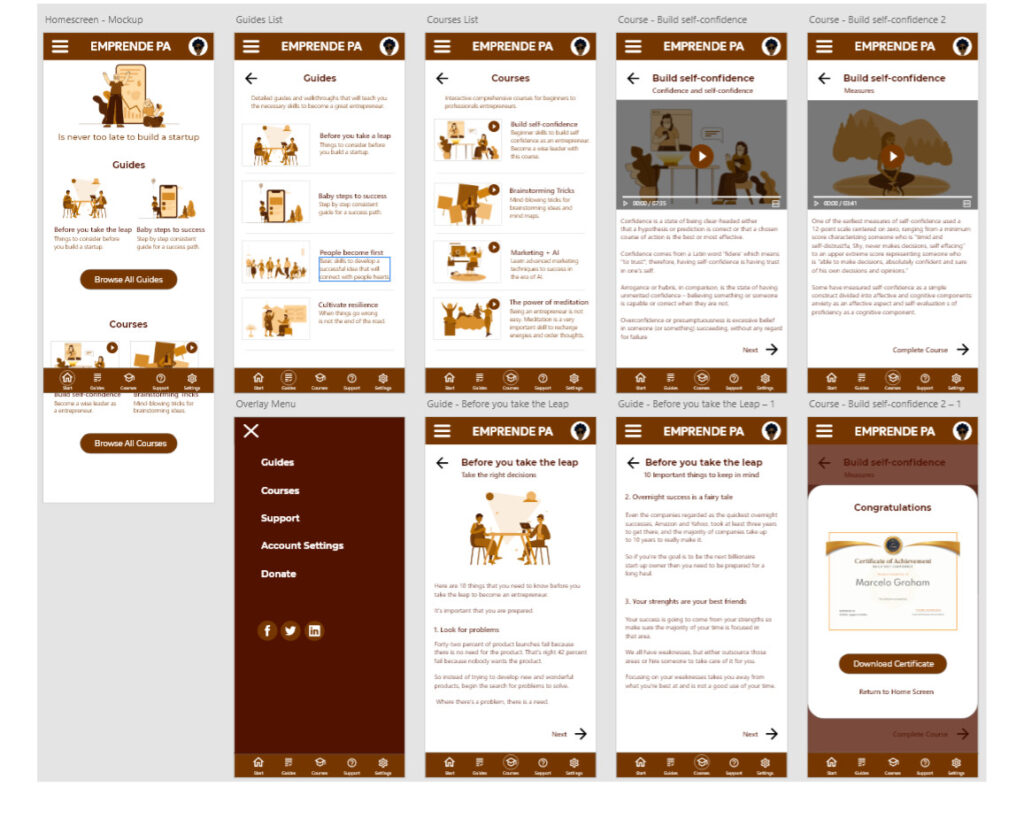
After synthesizing the insights and analyzing the results, I built the following hi-fi prototype.
Responsive Website Design
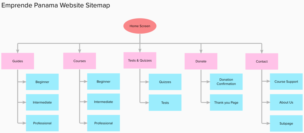
After designing the hi-fi prototype for the dedicated mobile app, I started the responsive website design with an information architecture site map.
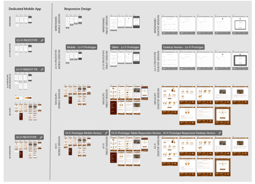
Then I began with the wireframes, then the low fidelity prototypes, mockups, and finally the high fidelity prototypes.
I want to share how my entire Adobe XD the canvas looked when I had all the designs on the screen. Check this out:
As you can see, I designed all the screens for the responsive website following the progressive enhancement approach (smaller screens to bigger ones).
High Fidelity Prototypes
Responsive Website Versions
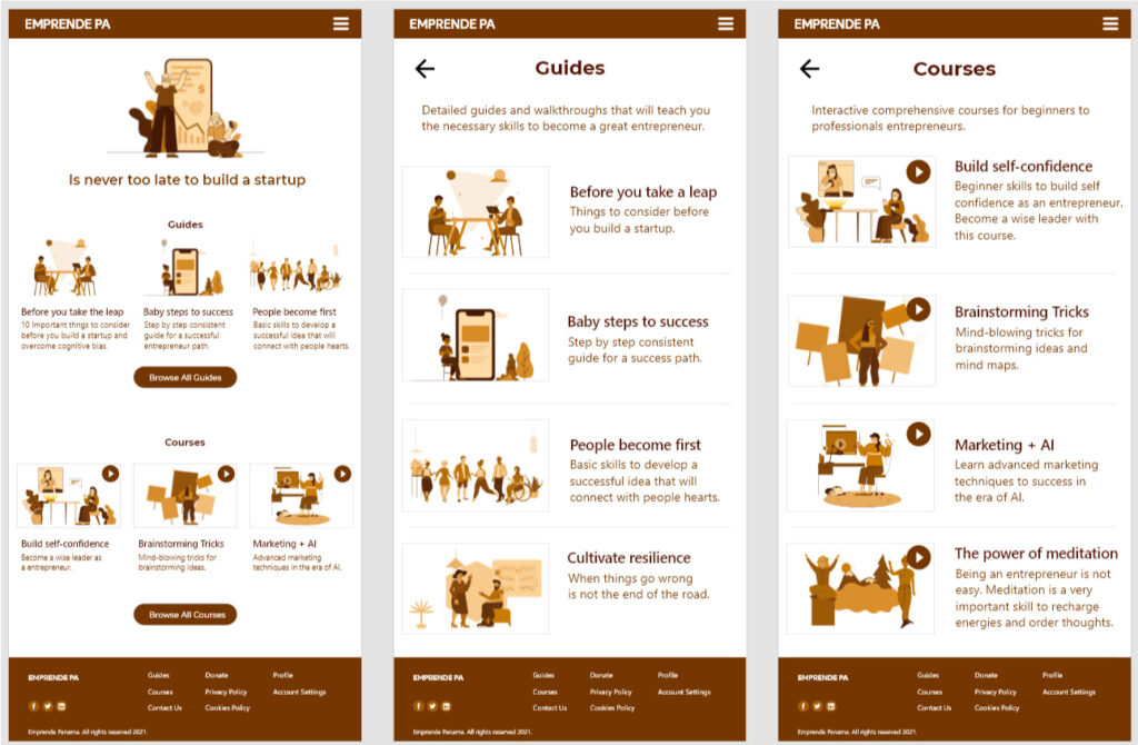
I’m sharing a few screens of each version of the responsive website (mobile, tablet, and desktop) and the prototype links of each one so you can test them right away.
Mobile Responsive Website
Tablet Responsive Website
Desktop Responsive Website
Additional Research
After receiving more feedback for the high fidelity prototype of the Emprende Panama app and website, new features that I will add pretty soon are dark modes, multilingual website (English and Spanish), “how do you feel” cognitive section, and probably other interesting ideas that are still under review.
Accesibility
Emprende Panama is a social good online platform, so I designed everything with accessibility in mind. I’m very aware that empathy is one of the main pillars of a great UX designer. Let me explain briefly what I included:
- I Followed WCAG Standard colors for good contrast considering users with impairments.
- Labels in items for assistive technology devices are included and compatibility with voice commands.
- Dark mode will be enabled in the next iteration
What I Learned
This has been the most difficult design that I have done so far. I learned that UX design is not an easy career and requires a lot of dedication. However, I have to say that I enjoy every phase of the UX design process.
I believe Emprende Panama will be a great social good online platform for this project if I develop the final version and launch it.
Special Thanks
I want to give special thanks to my tutors from Google UX Design Professional Certification, my peers who gave me a lot of feedback and wonderful ideas, especially:
Zinaida Krivchenko
Phoebe Crayk
Carlos Bernardo Jr
Aya Galloway
Kathy Pham
Nastassia Zharnouskaya
Chiara Moreni
Also, my family and my sponsor Unitytop.
Did you like my case study?

It’s my pleasure to help all UX students and enthusiasts. You can take this or any of my case studies as a guide for your UX certification process.
Feel free to contact me, using the contact page on my site. Also, you can contact me via LinkedIn and schedule a call with me. I’ll be more than happy to answer your questions about the entire UX Design process, and review your assignments in Coursera, EDX, Interactive Design Foundation, or any other professional UX design certification course.
Aside from that, I’ll appreciate with my ❤️ any support you can give me via the “Support with a cup of coffee” button below.

